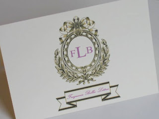
I have two new versions of Felicia's personalized stationery for her blog: www.fragrancebelleslettres.blogspot.com
This is Felicia's favorite design of the three I sampled for her the other day.
I also posted Felicia's design samples on Ink Stationery Studio's Facebook Fan Page and asked
which of the designs everyone liked the best.
This is hands-down the favorite of everyone who viewed the designs and sent me a message.
I changed the fonts to the lavender color which is Felicia's preference.
This is a close-up view.
After correcting Felicia's blog address, I changed the font color to the same lavender that is used for the fonts on the front of the note card. I think the color consistency for the fonts is best for this design.
Felicia asked if a banner could possibly be added to this design. The concern is that by added the banner, the initial crest design will become smaller. The crest design did have to be re-sized and made smaller in order to add the banner beneath. Also, the Fragrance Belles-Lettres wording had to be reduced to fit the banner.
This is a close-up of the design.
I only wanted to sample the design this way so Felicia could see what it would look like.
I think it's great when a client digs in and asks to see additional versions or additional colors of a design.
That is what having a custom design made especially for you is all about.
Here is the original version sampled for Felicia.
I hope you like.
Let me know your thoughts.
Carol


No comments:
Post a Comment